
Case study
Mobile • 6 weeks • Q2 2024
Creating a simpler way for businesses to get paid
Project details
My role
Lead Product Designer responsible for end-to-end delivery; discovery, ideation, prototyping, validation, and delivery. I also contributed to and maintained the design system throughout the project
The team
I worked as part of a product trio (myself, Product Manager, Lead Developer) within a cross-functional team of six, including three developers. We collaborated daily to shape and ship this feature across mobile and web.
Overview
This case study details the redesign of Countingup's "Get Paid" tab, addressing small businesses' struggles with tracking payments and managing invoices. Through user research, we identified key pain points and aimed to enhance the interface for better usability. The result was a successful launch that significantly increased engagement with payment features.
The challenge
Problem statement
The existing “Payment request” feature has been stagnant in usage at around 1.7% of users since launch. How might we increase the appeal of this feature so it is beneficial to more users?
Hypothesis
If non-invoice users have a simpler way to request payments that is tracked, we’ll see an increase of users requesting payments through Countingup
Background
The Payment Request feature was originally introduced in response to a survey which stated that 41% of users don’t use invoicing, to introduce a way for users to track payments through Countingup.
The process
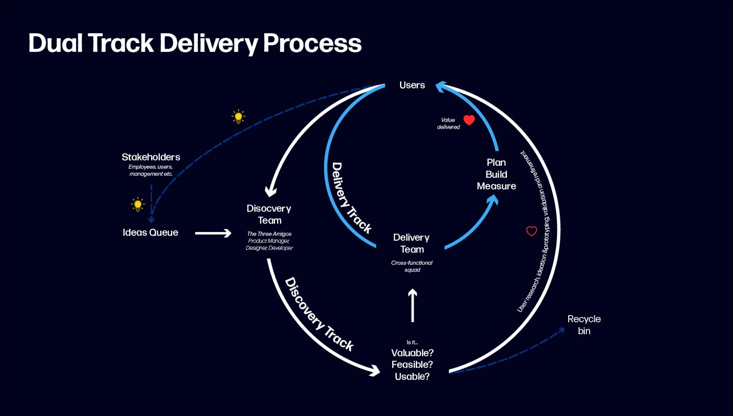
At Countingup, we follow this process when collaborating within our cross-functional teams. While at Countingup, I recognised the need for a consistent product design and delivery approach across squads and led the process of workshops where we discovered and defined our process. In these workshops with the Head of Design, CTO, and wider teams of developers and product managers, we streamlined our workflow into two tracks, Discovery and Delivery.
The Discovery track focuses on validating customer needs and testing ideas, while the Delivery track ensures efficient execution of those validated solutions. This approach allows us to innovate quickly without slowing down development, ensuring we build the right products and ship them rapidly.
Reviewing analytics
Low amount
of monthly active users use payment requests
Few
users of the Get Paid tab choose to create a payment request
High proportion
users abondon mid-flow when creating a payment requests
14×
more invoices than payment requests are created in the same time period
Competitor analysis

We reviewed a number of our competitors, such as Monzo, Starling, Tide, Anna and Revolut. We found that all of these competitors offered a “payment link” functionality, which was similar to the request that Countingup offered, but rather than just being purely administrative and resulting in a text message, it lead to a payment portal that delivered value for the customer of the business owner’s customer.


A portal that communicates payment information to the customer of the user
Offers ability to pay via card, apple pay/gpay or easy bank transfer
Minimal details collected to create a payment link
User survey & interviews
We sent out a survey and then conducted round of interviews with 15 of the survey respondents about their current experience with the Get Paid tab and requesting payments.
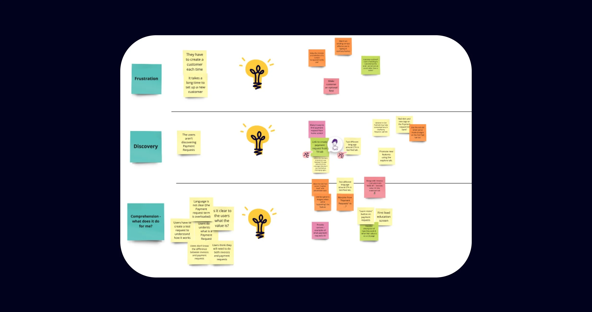
Highlights from the research
Many users could benefit
Most survey respondents request a payment from their customers verbally or over the phone, the next highest group of respondents send an email or text message to request a payment. Both of these could easily transition to a payment request.
High proportion of users were unaware of the feature
These survey respondents had not heard of the payment request feature before, indicating an issue with new feature promotion and discoverability.
High adoption rate of invoices for non-VAT users
These users don’t need to use an invoice, but many do so to request payment in a professional manner
Users don’t understand what payment requests are
Some users reported that they thought the feature was used to remind a customer to pay an invoice
Ideation session
We held a session with our cross-functional team to brainstorm ideas for improving the paymnet request feature. As part of the process, we conducted a Crazy 8s exercise, allowing everyone to quickly sketch and share ideas. Afterward, we discussed and consolidated these ideas into actionable insights.
Key ideas the emerged from the session
Simplifying the details required to create a payment request to make it as quick as possible
Data shows that users don’t change the due date of invoices or payment requests
Creating a payment portal to create a shareable and professional alternative to an invoice
Enable card and open banking payment methods to make it a more useful alternative
Rename payment request to Payment links to match the industry-wide name for the feature
Areas for improvement

Delivery phases
Following the agreement of areas we could improve, we defined what the MVP would be, and defined the iterations from there.
First iteration
Redesign the Payment requests feature into Payment links, making minor improvements to the usability of the creation flow and linking out to the portal which features the bank details and the already existing stripe integration
Second iteration
Introduce easy bank transfers as a payment option to the payment link portal
Third iteration
Extend the payment portal to be used on Invoices, to ensure consistnet functionality across all tracked payment options
Potential future iterations
Additional payment methods such as Apple Pay, Google pay.
Sharing a payment link via QR code.
Enabling Tap to pay via Stripe.
User journey
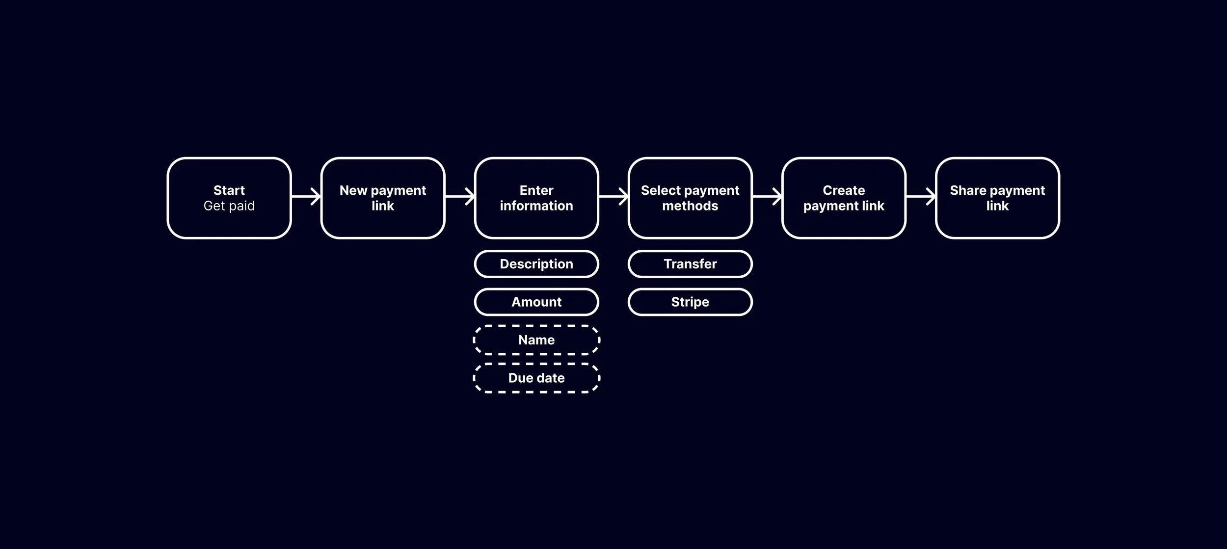
User creates payment link
Iteration 1
New payment link
In-app screens
Wireframes
After identifying the key areas for improvement, I created a wireframe to help communicate how the new create payment link experience could look.
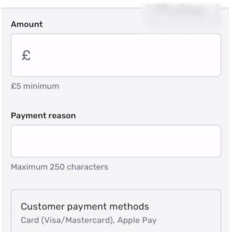
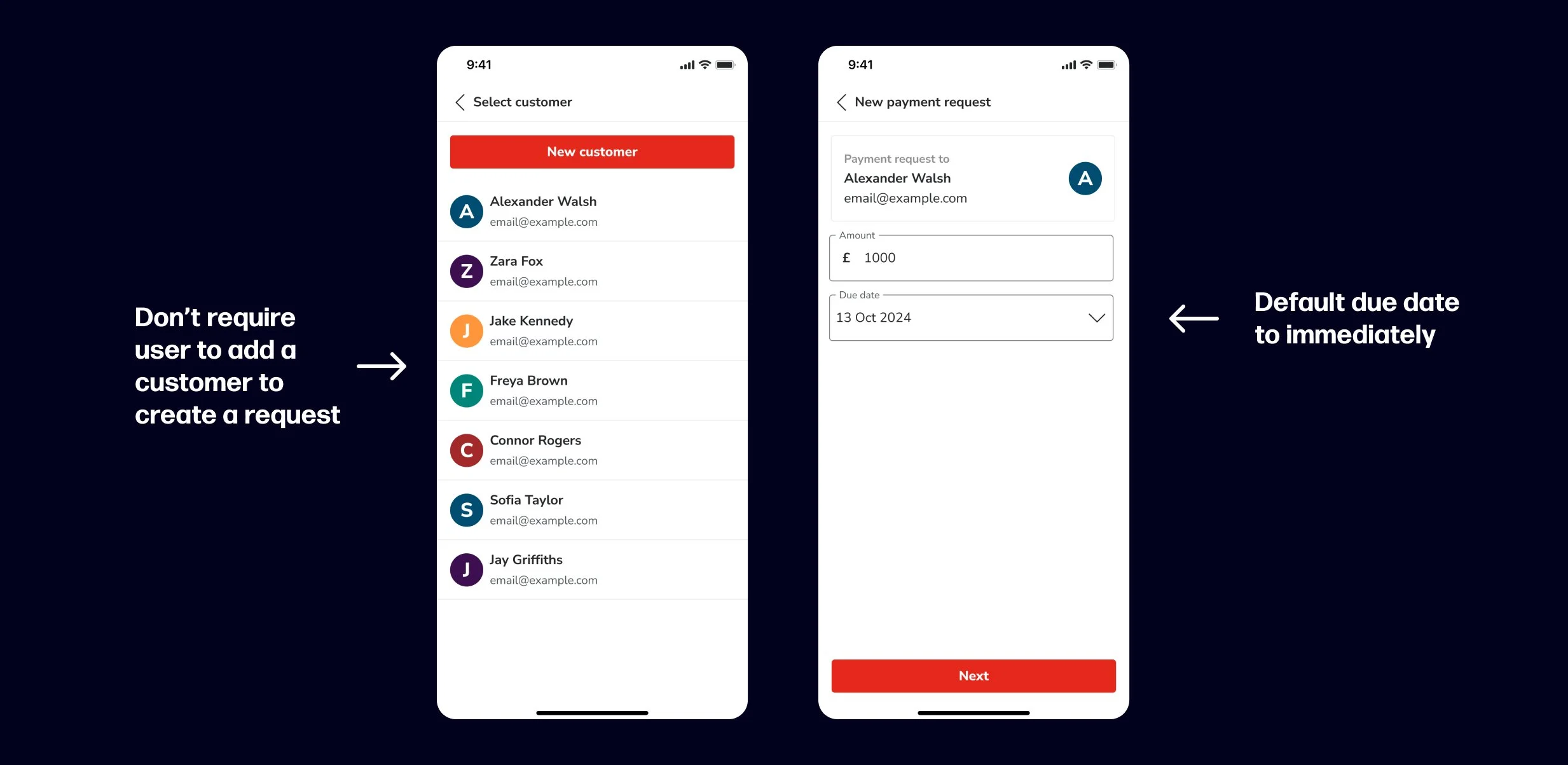
Simplified information requirements
The first screen only requires the user to input an amount and description. There are buttons to add additional data if the user would want this.
Reduced taps
Given the simplicity of the data entered, the confirmation screen has been removed and the user can create the link in one-tap. The following screen shows the amount and other information entered, and from this screen they can share the link using their preferred method, or share it later.
Initial designs
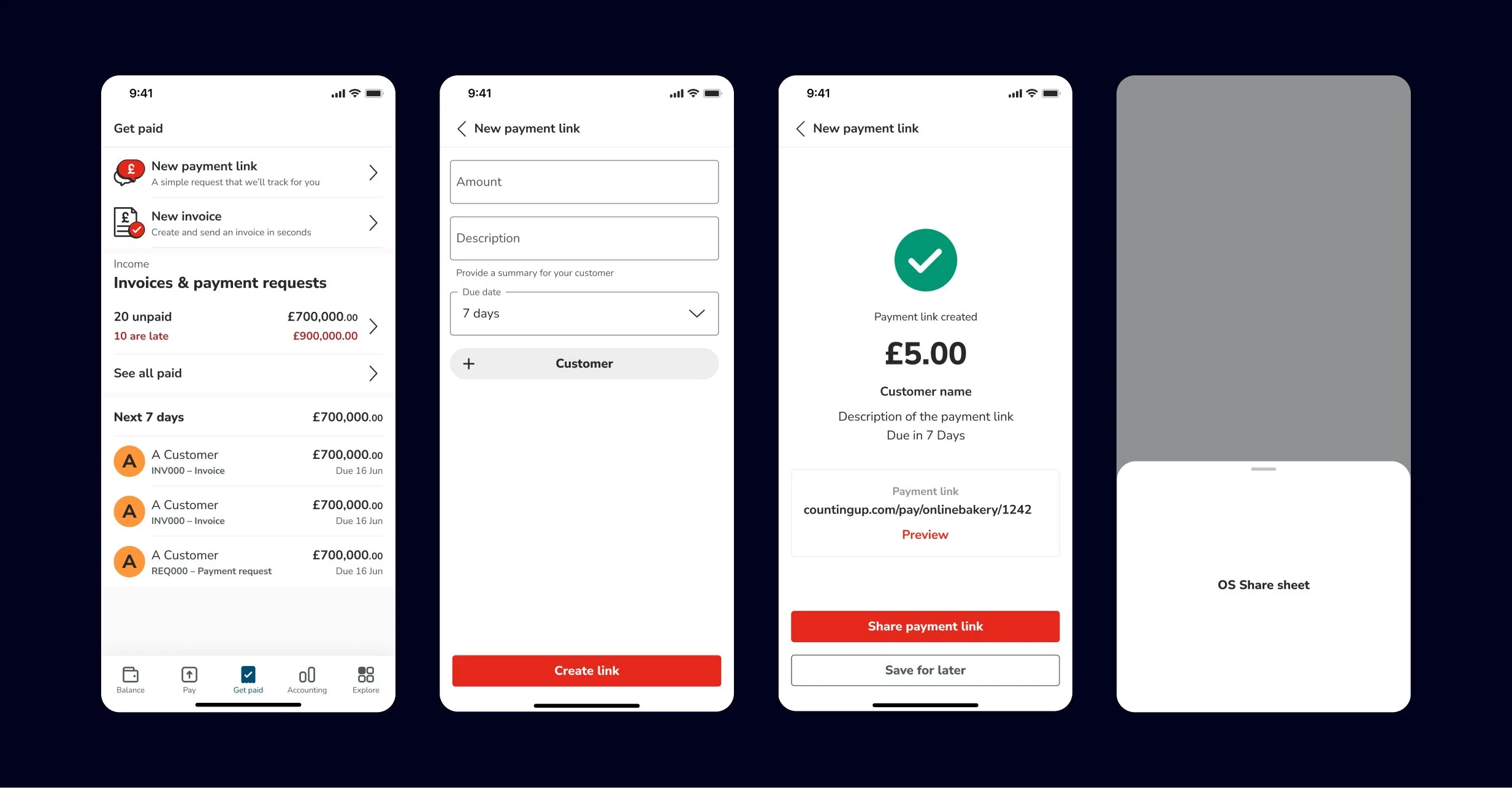
After creating the wireframes, I designed these screens as a higher-fidelity design to help illustrate how these screens could look using our design system components and to gain better insights during user testing.
I spent some more time exploring options for the new payment link screen, focussing on how the user can input the customer information and due date, trying to keep this easy to understand and swift to create, while providing the user with the options they need.

User testing
I distilled down the options to two prototypes to share with users. One which features the due date with an option to add the customer, and another which hides both the due date and customer behind an accordion. We then showed these to a group of 9 users.
Highlights from interviews
Due date not important
Participants highlighted that they usually get paid within 1 or 2 days and likely wouldn’t bother with setting a due date if they had the option
Lot’s of one-off customers
Many participants highlighted that they have one-off customers and a payment link where you don’t need all the details of the customer to create a contact card would be useful. (For an invoice, you need their address and other details to create the invoice)
The speed and ease to request a payment is important
Participants found it positive how quick it is to request a payment, and that the app will keep track of the payment to let them know when it is paid.
Design development
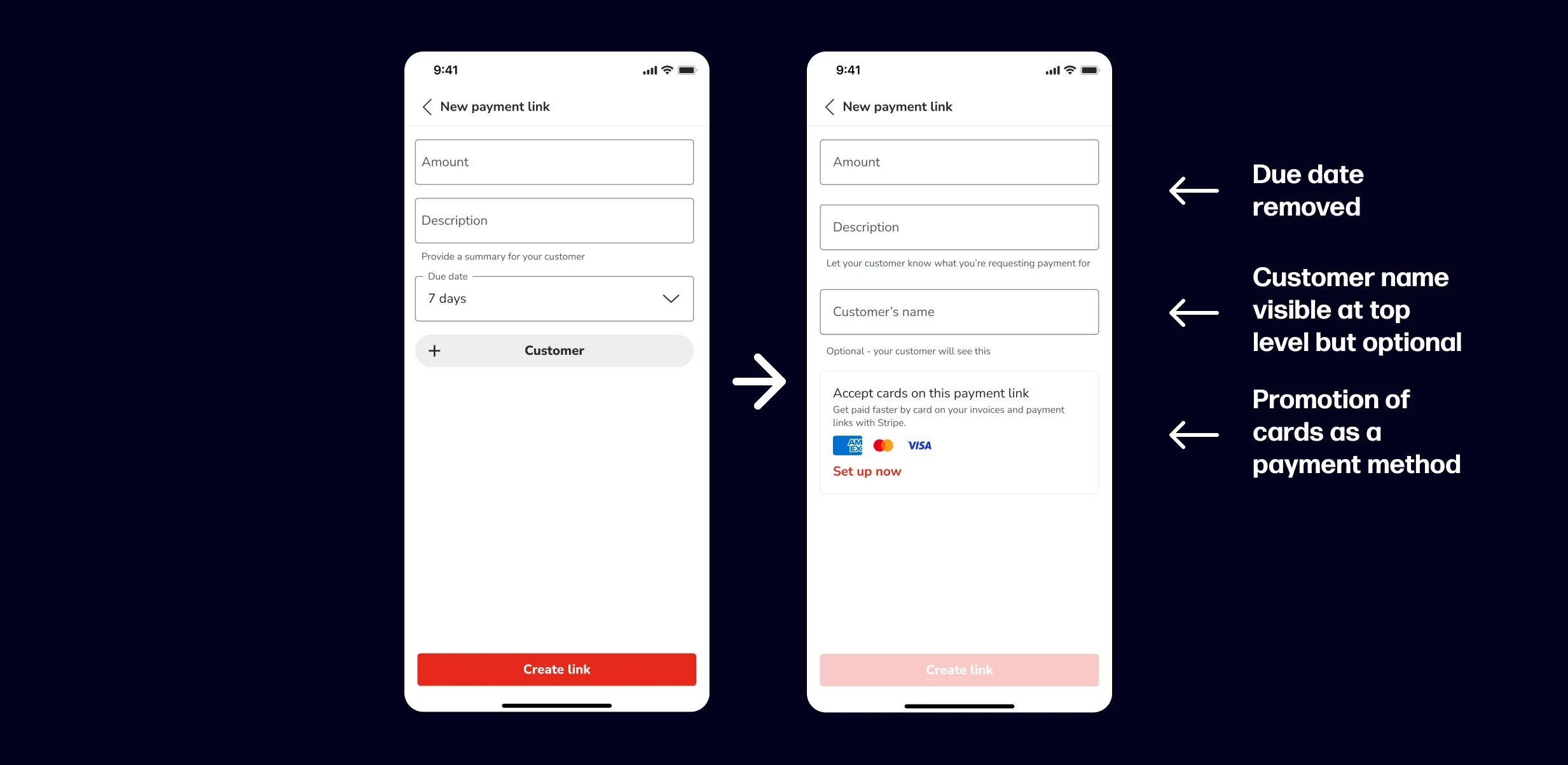
Update to new payment link screen
Update to new payment link screen
Following on from insights in the research, the due date was removed and the customer name wasn’t hidden behind a button, but was marked as optional. I also added a promotion for card payments as a payment method, to increase visibility of this functionality and improve uptake of this feature. The card issuer logos were added as an identifiable visual hook, so the user can understand the promotion without having to read in full..
Toggle payment method
Card payments can be toggled on and off for individual payment links. The app will remember the user’s last option when they create the next payment link.
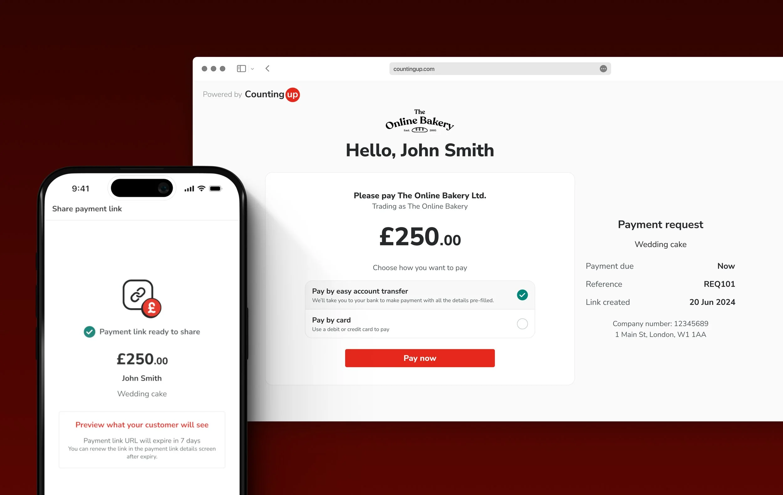
Update to share payment link screen
In order to ensure it is clear to users that there is still an action for them to take, the emphasis of success of the link being created was toned to, and the wording was changed to “Payment link ready to share.”
Due to technical limitations, we weren’t able to display the URL text in the app. Also for safety reasons the URL will expire after 7 days, since most requests were paid within 2 days we didn’t anticipate this to effect many users, but a reminder was added so users are aware. A “Done” button was added so the user can open the share sheet as many times as they need, and exit the screen when finished.
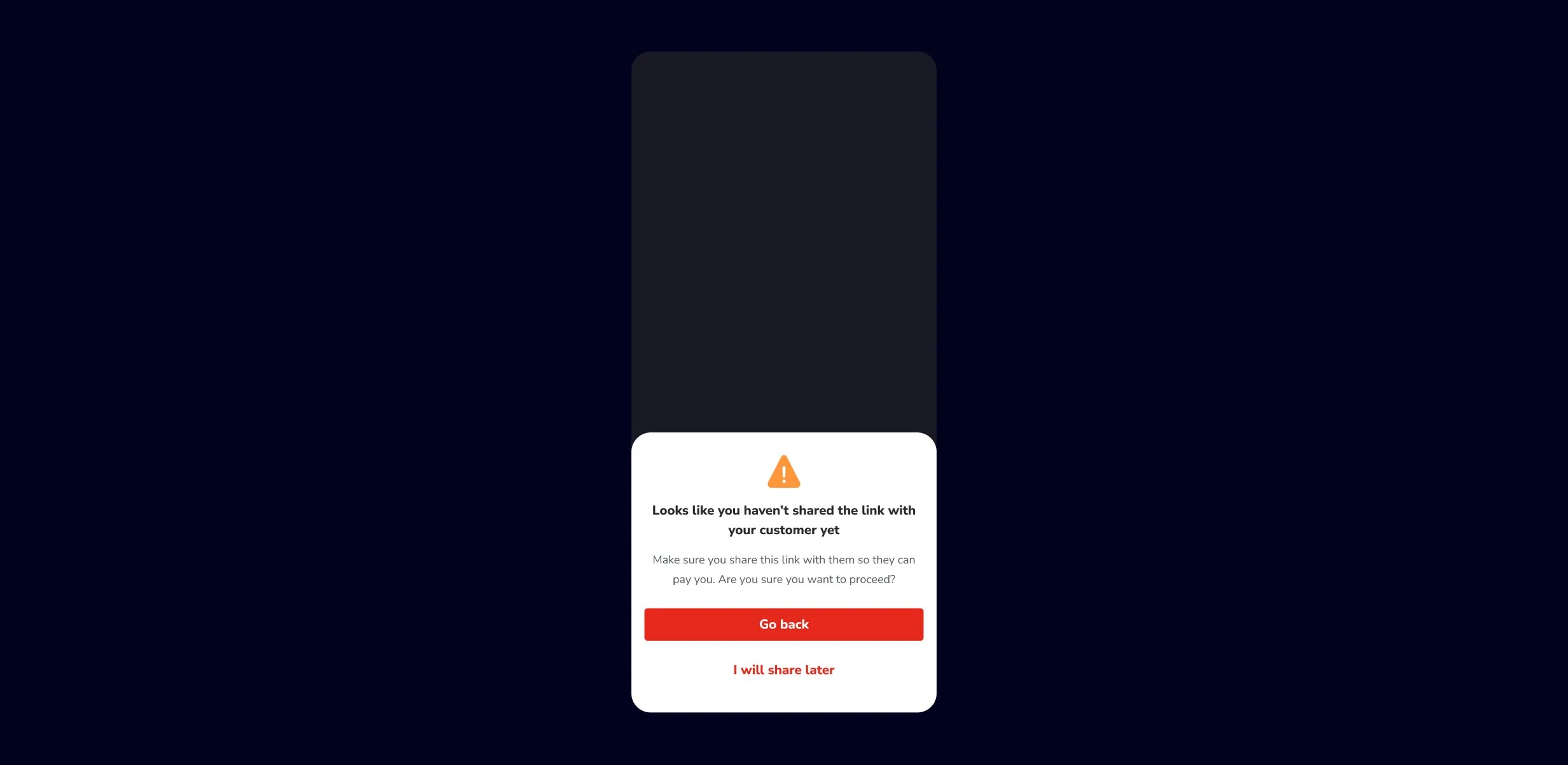
Warning if user doesn’t share payment link
If the user taps “Done” without sharing the payment link, they’ll get a warning to ensure this is their intended action.
Final payment link creation designs
Get paid tab
Flow
Iteration 1
Payment portal
Responsive web
User flow
User’s customer makes a payment
Wireframes
After mapping out the user flow. I took a look at what the payment portal could look like. This was the first design on responsive web for Countingup, so there was no prior art to build from and I was starting almost from scratch. I wanted to keep the screen as simple as possible, focusing on displaying the payment method and payment options.
Layout exploration
The first option emphasises card payment as the primary payment option, with bank transfer presented as a secondary option. The benefit of the layout is the more convenient payment method (pay by card) is prioritised, but this method comes at a cost to our user so they may not appreciate this type of layout.
The first option emphasises card payment as the primary payment option, with bank transfer presented as a secondary option. The benefit of the layout is the more convenient payment method (pay by card) is prioritised, but this method comes at a cost to our user so they may not appreciate this type of layout.
I then explored how the screen could be laid out to ensure the best hierarchy. I did this in a mid-fidelity using components from the Countingup design system, but still exploring in black and white to avoid colour considerations slowing down the process.
High fidelity designs
This first design displays all the information at once, so the user doesn’t need to tap further to get the bank transfer details. However, the content is quite lengthy, and could be quite overwhelming. A main benefit to this approach is technically it is not complicated to implement, and since in the next iteration we won’t need the bank details this could be a benefit.
The second design makes the screen feel much lighter, allowing the user to focus simply on making a choice between bank transfer or card payment. However, since only a small percentage of users have card payments enabled, it could be additional to work to benefit only a few users.
Following discussions with the team, we decided we were going to show some of the portal designs in the round of user testing we were doing for mobile app. We decided not to move forward with the design that prioritised the card payment over the bank payment (option 1), and focus on the designs which fairly balanced the two payment options.
User testing
While we were unable to recruit the customers of our users for testing, we conducted usability testing with our own users while we were showing the app. Even though they are not the true end user, they would still be able to offer an outside perspective.
Highlights from interviews
First option has a lot of content to read
Some participants took some time to read and understand everything before being able to answer our questions, indicating that the content could be overwhelming at first
No major difference in usability
When participants were asked to perform a task such as pay by card or locate the account details, they were able to do this with ease on each of the options.
Final designs
This first design displays all the information at once, so the user doesn’t need to tap further to get the bank transfer details. However, the content is quite lengthy, and could be quite overwhelming. A main benefit to this approach is technically it is not complicated to implement, and since in the next iteration we won’t need the bank details this could be a benefit.
The second design makes the screen feel much lighter, allowing the user to focus simply on making a choice between bank transfer or card payment. However, since only a small percentage of users have card payments enabled, it could be additional to work to benefit only a few users.
After the user testing was concluded, we decided to move forward with the simpler option. Since there was no major difference in usability, and in the upcoming iteration the layout would have to change, we decided it was best not to put in additional effort now if we’ll need to do that work again in the near future.
Iteration 2
Open banking
Responsive web
User flow
Payment portal - Design exploration
Option 1
The first option took advantage of the increased space, and placed two buttons in the main section, to pay by account and pay by card.
Option 2
The second option utilised the additional space desktop and provided a dedicated section for the request details
Option 3
The third option uses a list select component to provide further details and we could also use logos to provide a visual hook for the user.
Bank selector - Design exploration
Option 1
The bank selection screen displays back a list of banks supported by the open banking provider, with an option to view the account details if their bank is not supported. At this point, we didn’t know how many banks we could support. I explored an option using a list, with a button for where their provider isn’t listed at the bottom.
Option 2
The second option I explored displays each banking provider in its own card, on mobile this takes on a similar view to the first option, but on desktop this approach allows multiple banking providers to be displayed per line.
Design developement
Payment portal
For the payment portal screen, we proceeded with the list select option, as it provided the space to explain the payment methods further, this is especially useful as “easy account transfer” may not be known to all users. We removed the banking and card logos to reduce visual noise on a busy screen, and to avoid the situation where users don’t see their provider here and think that this isn’t for them.
Bank selector
The bank selector screen with the list component was chosen to proceed with as the single list column was consistent across devices, and easier to read than having multiple accounts on the same line. The open-banking provider supported over 50 accounts, so the list was changed to be a selection of the most popular banks, with the user encouraged to search for their account. For users whose accounts are not supported, the messaging was distinguished from the list of banks to aid legibility, and further description was provided with an action to “Pay by manual transfer” to better set the users expectations.